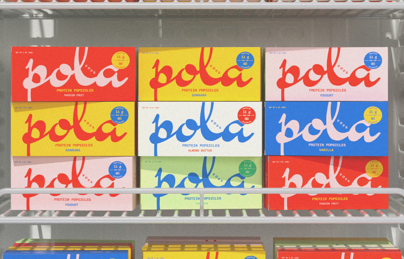
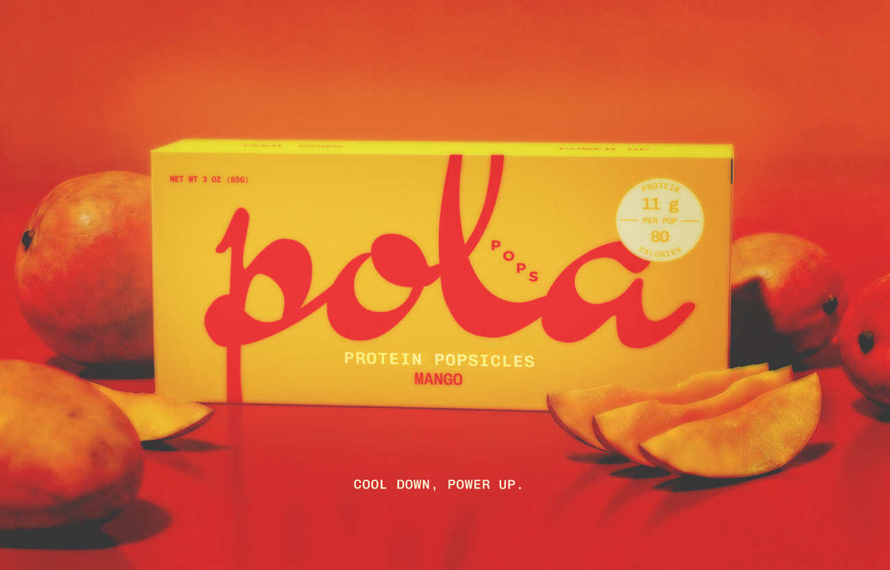
La Bodega De Video

A boutique audiovisual production company focused on commercial and promotional projects. Born from the legacy of a family produce business, it brings the essence of down to earth commerce to the world of audiovisual production.

Its philosophy is based on transparency and respect for the talent and professionals it works with, and on delivering quality work and personal interaction with the client.

NoWall

A brand designed for those who live to push beyond limits, triathletes, marathoners, and high-performance seekers. Starting with protein bars that actually taste good, their products aim to expand into a broader portfolio focused on enhancing athletic performance through real, functional ingredients.

Its name is inspired by the concept of “the wall,” that defining moment in a marathon when the body and mind are tested.

Its visual system contrasts control with energy. A strict grid holds together expressive elements: vertical gradient bars suggest heat, motion, and intensity; blurred images capture momentum and physical effort; while elegant serif typography adds structure and editorial sophistication. The palette is restrained, almost monochromatic, with tactical bursts of red to evoke determination.

Anomalía

An artisanal cold brew brand that emerges as a rarity in the modern desert—a true oasis of stillness and presence in a world that’s constantly rushing. Each bottle is brewed, bottled, and hand-delivered by its founder, in a slow and deliberate process that turns coffee into a ritual, not a commodity.

Inspired by desert landscapes, mineral symmetry, and natural stillness, the brand identity is rooted in visual silence. The logotype was designed entirely from scratch: a custom typographic piece influenced by pre-Columbian stone carving techniques, yet with retro depth that feels both grounded and contemporary. The visual universe honors the product with warm light, strong shadows, and compositions that invite reflection.

Anomalía doesn’t shout—it lingers. It inhabits the space like an object waiting to be noticed. More than a beverage, it offers a moment of calm for those who know how to find what’s rare.

Avte Bardo

Avte Bardo is more than a brand; it’s a poetic exploration of artistry, culture, and storytelling. Conceived as a living archive, it invites reflection through objects that carry memory, symbolism, and presence. At its core lies a devotion to craftsmanship — each piece curated as a vessel of ancestral wisdom and cultural heritage.

As the studio behind its creation, we developed Avte Bardo’s brand identity from a place of reverence: the need to make ancestry feel contemporary without erasing its origin. The challenge was not to modernize tradition, but to let it speak in a new language — one that could exist within the now while remaining rooted in the depth of what came before.

We designed a typographic system exclusively for the brand — a typeface that doesn’t just communicate, but embodies. Raw, sculptural, and tactile, its forms reference the mineral, the ancient, and the ceremonial. Each letter becomes an artifact, each word a gesture of continuity between past and present.

Poisson

A supplement brand that challenges the norms, that offers the unimaginable: one pill containing everything you need to make your wellness journey more simple and efficient.
We transcend boundaries in an elegant yet witty matter. We’re the antidote for a world full of choices. We deliver honesty, purity, and practicality in only one pill.
Join the antithesis of supplements—a smoother, more transparent lifestyle starts with Poisson.