NoWall

A brand designed for those who live to push beyond limits, triathletes, marathoners, and high-performance seekers. Starting with protein bars that actually taste good, their products aim to expand into a broader portfolio focused on enhancing athletic performance through real, functional ingredients.

Its name is inspired by the concept of “the wall,” that defining moment in a marathon when the body and mind are tested.

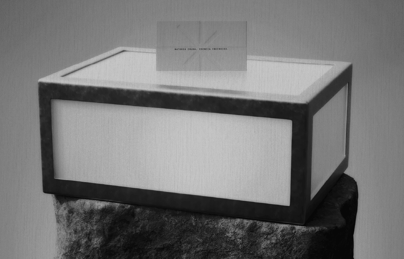
Its visual system contrasts control with energy. A strict grid holds together expressive elements: vertical gradient bars suggest heat, motion, and intensity; blurred images capture momentum and physical effort; while elegant serif typography adds structure and editorial sophistication. The palette is restrained, almost monochromatic, with tactical bursts of red to evoke determination.

Anomalía

An artisanal cold brew brand that emerges as a rarity in the modern desert—a true oasis of stillness and presence in a world that’s constantly rushing. Each bottle is brewed, bottled, and hand-delivered by its founder, in a slow and deliberate process that turns coffee into a ritual, not a commodity.

Inspired by desert landscapes, mineral symmetry, and natural stillness, the brand identity is rooted in visual silence. The logotype was designed entirely from scratch: a custom typographic piece influenced by pre-Columbian stone carving techniques, yet with retro depth that feels both grounded and contemporary. The visual universe honors the product with warm light, strong shadows, and compositions that invite reflection.

Anomalía doesn’t shout—it lingers. It inhabits the space like an object waiting to be noticed. More than a beverage, it offers a moment of calm for those who know how to find what’s rare.