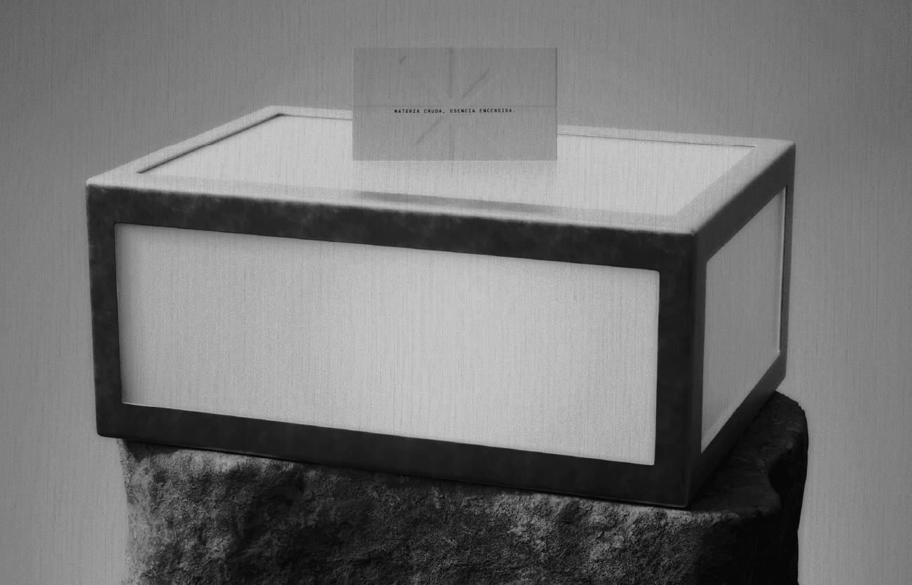
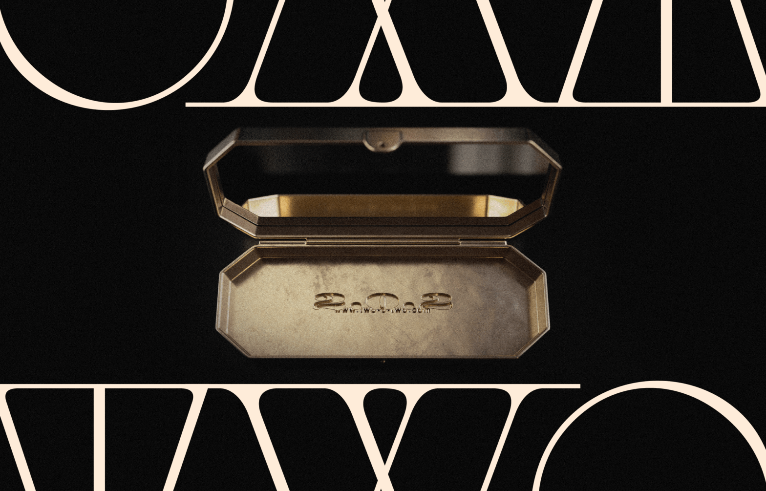
Two o Two

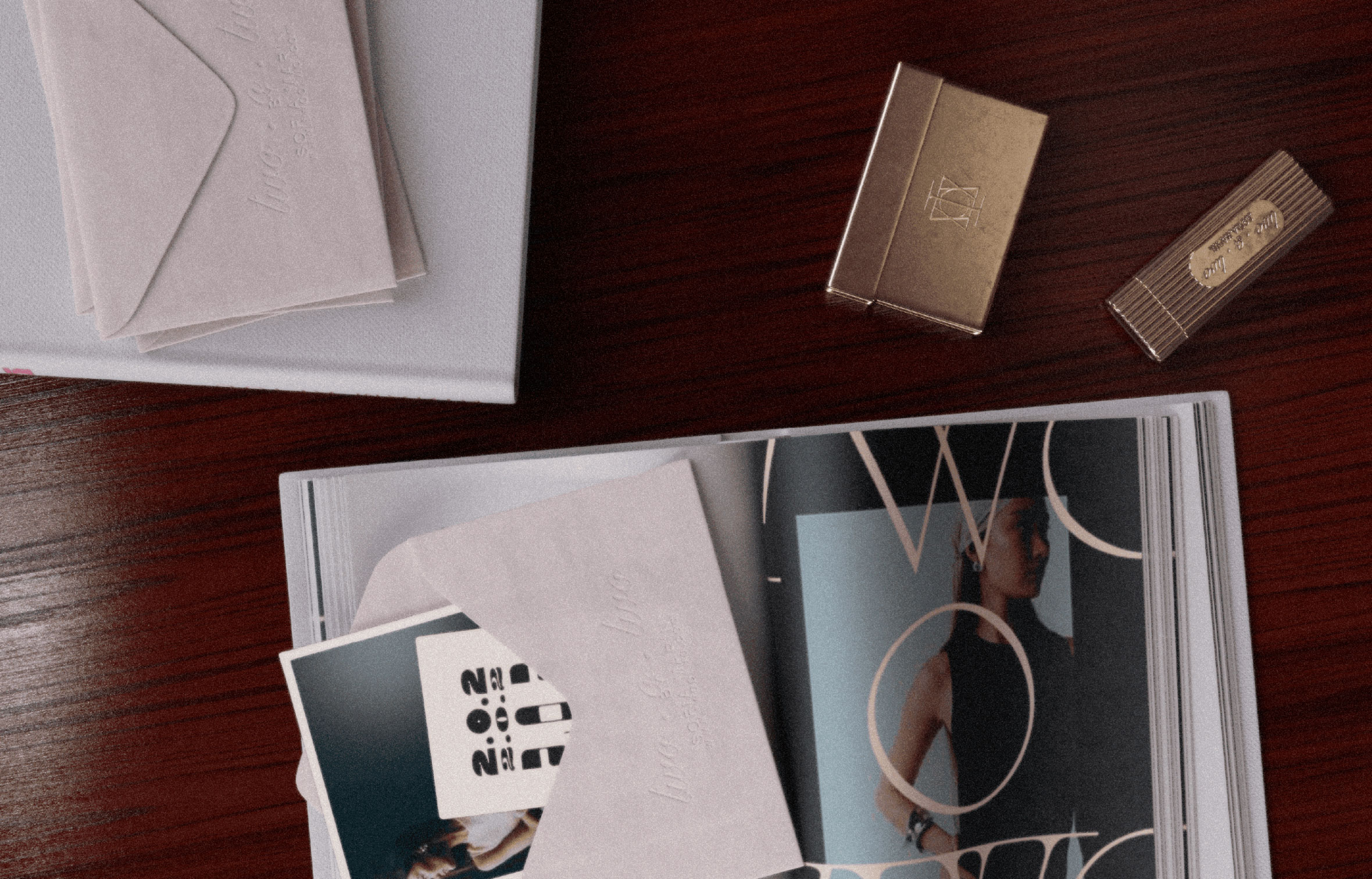
is a consulting studio specialized in elevating fashion and design brands through refined visual identity and strategic clarity.

By building a unique visual system, it guides brands in finding their true character, helping them trace their own path in today’s market.
Rooted in research and cultural understanding, Two o Two accompanies clients through the development of strategic direction, educational insight campaigns, art direction and execution, and styling.

Minimal yet layered with intention, its elegant serif typography anchors the identity with a sense of editorial rigor, while subtle complexities emerge through composition, pacing, and restraint—creating a language that feels timeless and distinctive.
Avte Bardo

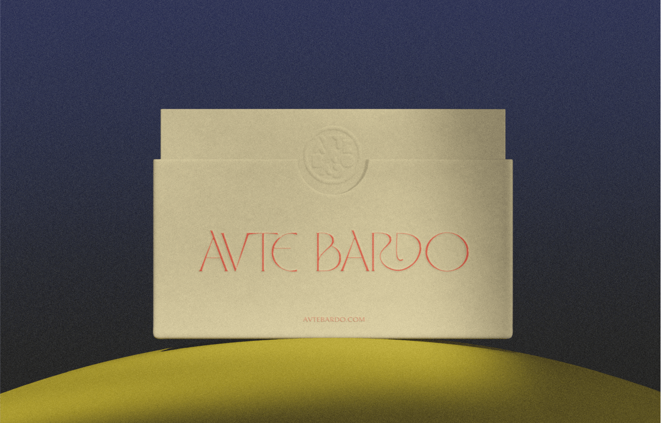
Avte Bardo is a poetic exploration of artistry, culture, and storytelling. Conceived as a living archive, it invites reflection through objects that carry memory, symbolism, and presence. At its core lies a devotion to craftsmanship — each piece curated as a vessel of ancestral wisdom and cultural heritage.

As the studio behind its creation, we developed Avte Bardo’s brand identity from a place of reverence: the need to make ancestry feel contemporary without erasing its origin. The challenge was not to modernize tradition, but to let it speak in a new language — one that could exist within the now while remaining rooted in the depth of what came before.

We designed a typographic system exclusively for the brand — a typeface that doesn’t just communicate, but embodies. Raw, sculptural, and tactile, its forms reference the mineral, the ancient, and the ceremonial. Each letter becomes an artifact, each word a gesture of continuity between past and present.

Express Checkout

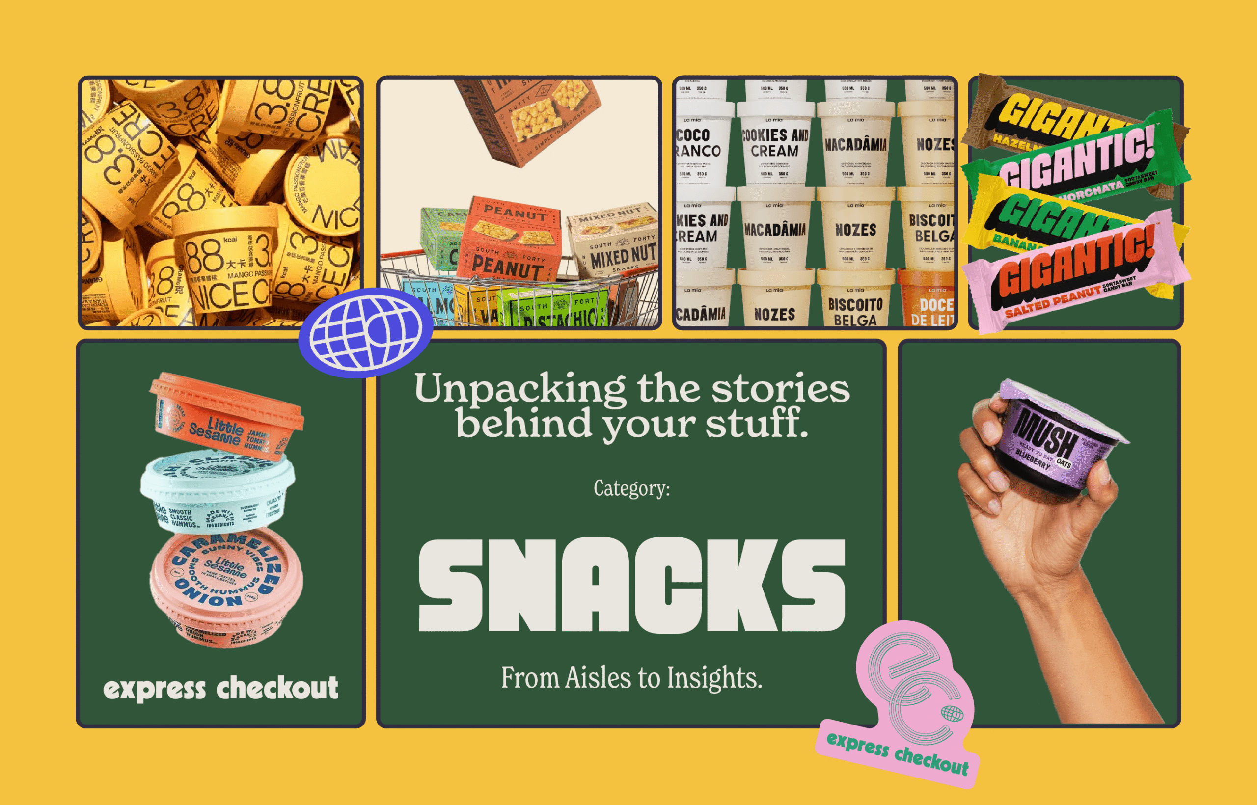
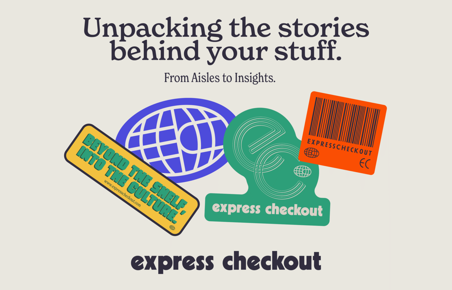
is a media company exploring the ever-evolving world of commerce. Through its newsletter and podcast, The Curious Consumer, founders Nate Rosen and Jenna Movsowitz unpack everything from consumer brands and retail to eCommerce, investment, and emerging trends. Going beyond headlines, the platform connects the dots between products, businesses, and the cultural forces shaping how we consume.

Inspired by vintage product catalogs, supermarket shelves, and the familiar language of everyday commerce, we developed a visual identity rooted in nostalgia. A distinctive yet uncomplicated system built around nostalgic color palettes, barcode graphics, and subtle references to traditional product packaging.

Much like the industry it covers, Express Checkout exists in a world filled with competing brands and visual languages. Our approach was to create an identity that could seamlessly coexist with them without losing its own character. A flexible, recognizable system that borrows from the visual codes of consumer culture to create a fresh editorial perspective on the very industry it explores.

Poisson

A supplement brand that challenges the norms, that offers the unimaginable: one pill containing everything you need to make your wellness journey more simple and efficient.
We transcend boundaries in an elegant yet witty matter. We’re the antidote for a world full of choices. We deliver honesty, purity, and practicality in only one pill.
Join the antithesis of supplements—a smoother, more transparent lifestyle starts with Poisson.