


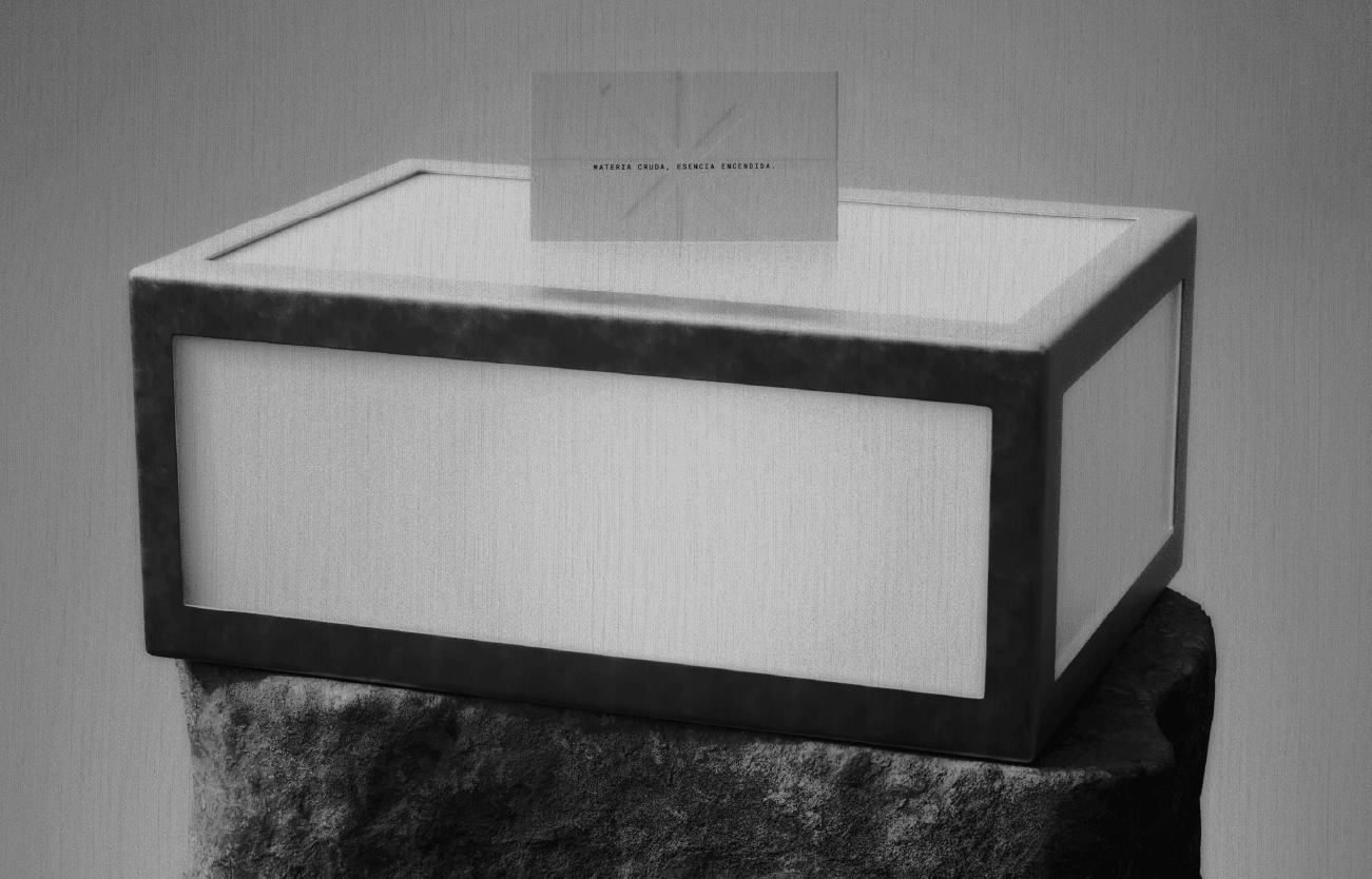
NoWall
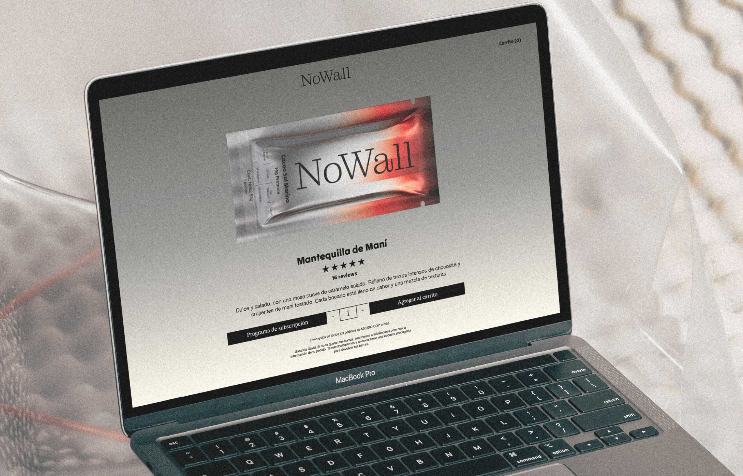
– A brand designed for those who live to push beyond limits, triathletes, marathoners, and high-performance seekers. Starting with protein bars that actually taste good, their products aim to expand into a broader portfolio focused on enhancing athletic performance through real, functional ingredients.Its name is inspired by the concept of “the wall,” that defining moment in a marathon when the body and mind are tested.
Its visual system contrasts control with energy. A strict grid holds together expressive elements: vertical gradient bars suggest heat, motion, and intensity; blurred images capture momentum and physical effort; while elegant serif typography adds structure and editorial sophistication. The palette is restrained, almost monochromatic, with tactical bursts of red to evoke determination.
Dec, 2025
NoWall
Medellín, Colombia
Branding & Packaging Design